
Our Corporate identity is the sum of all the signals we send out as a company. It is how we are perceived as business partners, suppliers, competitors and as an organisation.
Our identity is not only characterized by our history and our culture – but also through the way we present ourselves both in print and on screen.
The logo stands as the paramount identity-bearing element for Höegh Autoliners. As the primary emblem of Höegh Autoliners, it is to be consistently prioritized across all communication platforms.
The logo consist of a symbol and the company name. The symbol is a pictogram of the white flag with the capital “H” centered in the format. A thin line outlines the flag and the flag pole.
To ensure the accurate reproduction of the logos, please download the correct ones from this manual or our Intranet.
Do not try to replicate the logo.

Clear Space
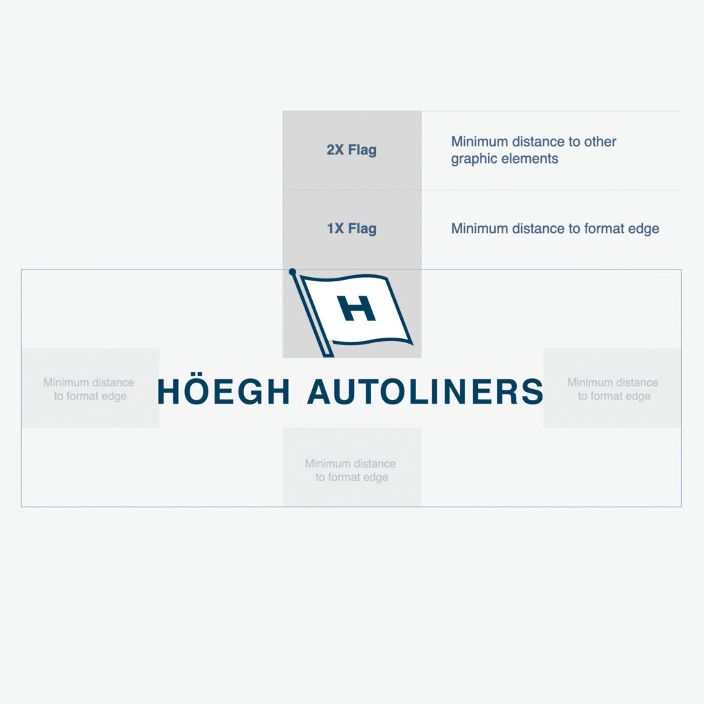
There must always be clear space around the logo to emphasise the importance of the logo and increase readability. We use a rectangle representation of the flag to determine the amount of needed clear space around the logo. See example to the right. There should be no other text or graphics in this area.
Minimum Size
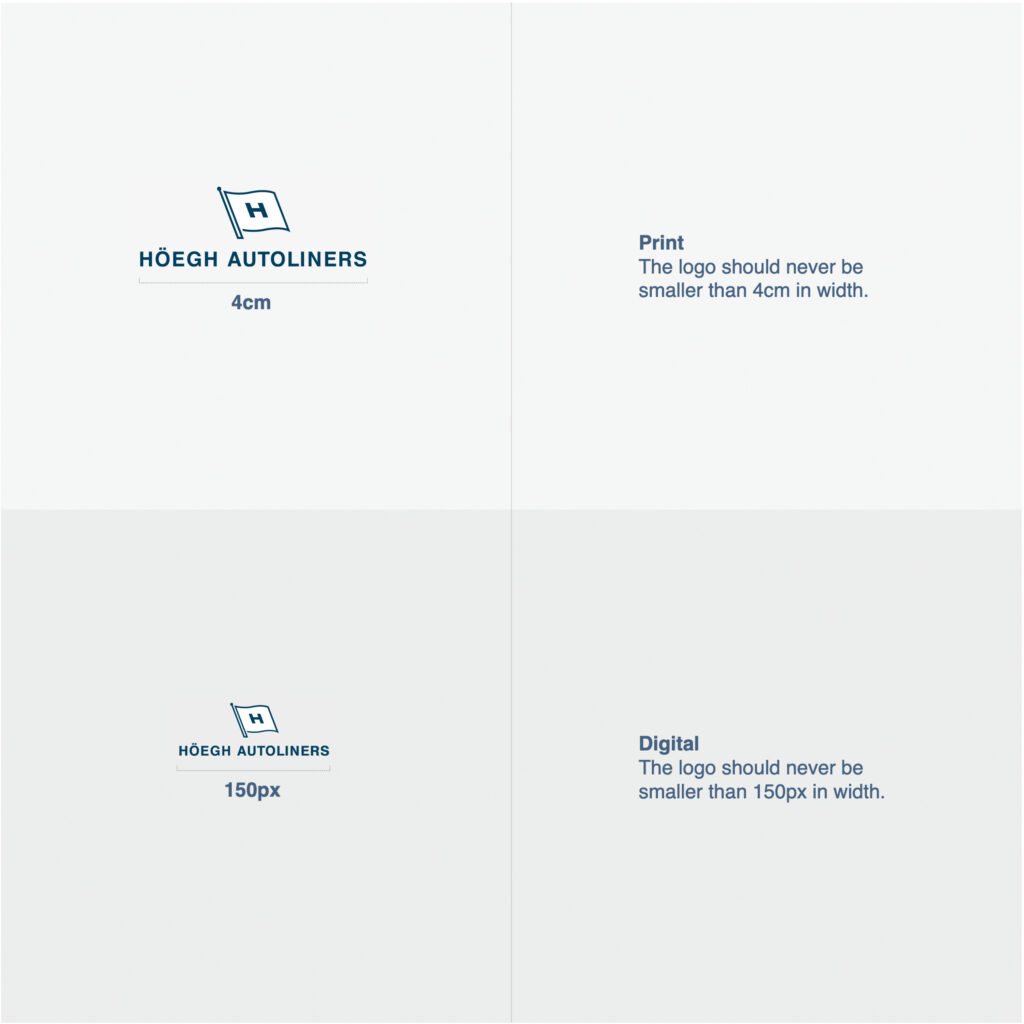
To ensure that our logo’s integrity is maintained, it is vital not to replicate the logo in sizes smaller than the described minimum size.
Background
The logo should always be positioned on a calm background, preferably white or light gray. In such cases, utilize our main logo in positive. If you need to display our logo on a dark background, such as our dark blue or a similar shade, use the negative version to ensure optimal results.
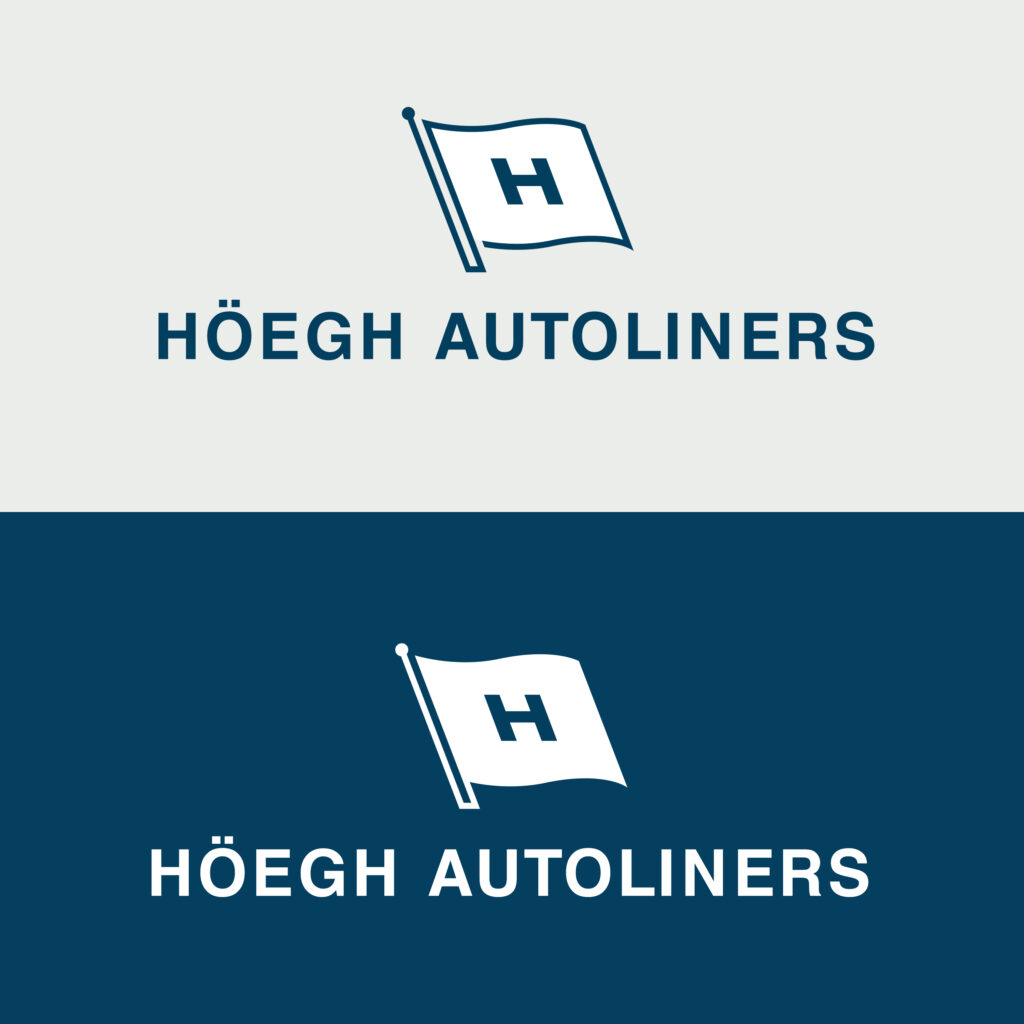
These are general usage rules for the logo.
Rules
Logo & Image
When placing the logo on an image ensure that the logo is still readable and placed on the calmest area of the photo. Also, ensure that the correct version of the logo (either positive or negative) is used for how light or dark the image behind is.


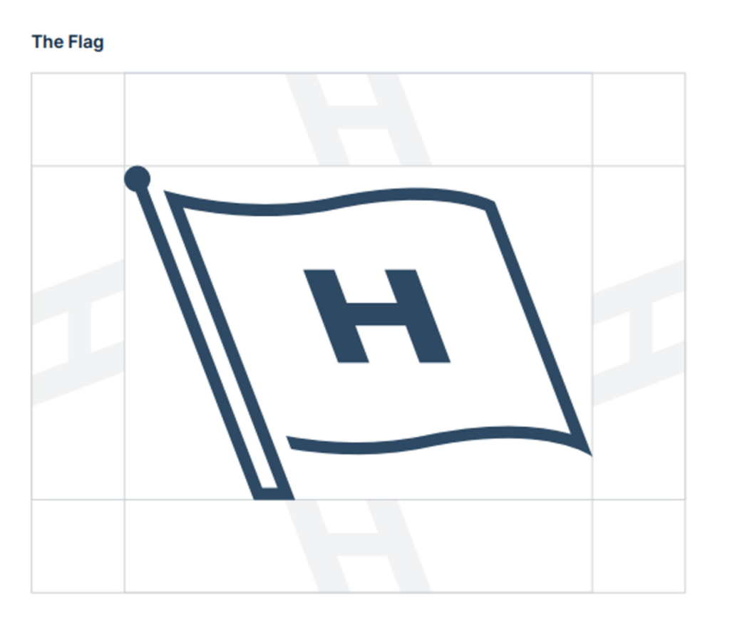
The Flag
Known as ‘the Flag’, our refreshed symbol amplifies our most salient and iconic asset.
Exclusion zone
The exclusion zone is an empty space established around the Flag to protect its integrity and ensure its clear visibility. The exclusion zone is defined as the width of ‘H. This logic applies to all versions of the Flag.
Minimum size
Minimum sizes have been specified for the Flag to ensure its clear reproduction. Displaying in sizes smaller than those specified here is prohibited.
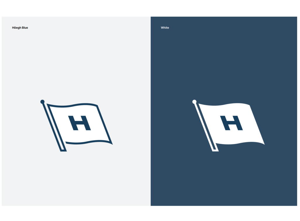
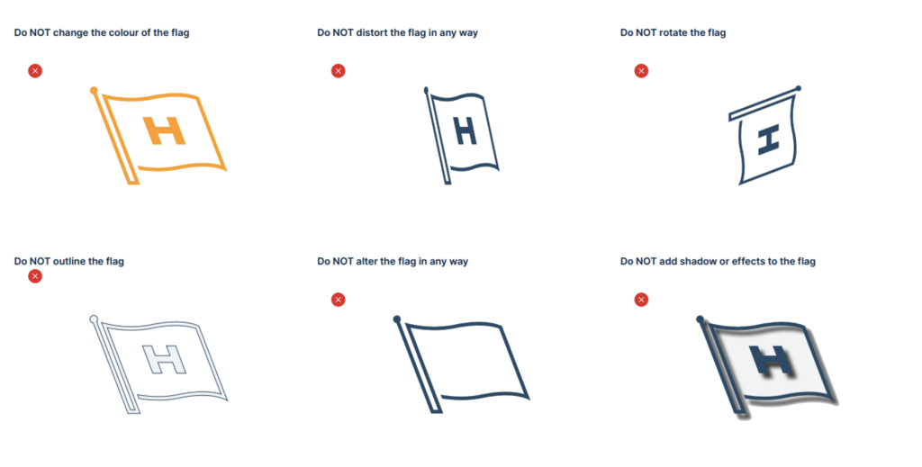
This package contains logo files for digital and print use. Please follow the rules when using the logo.